

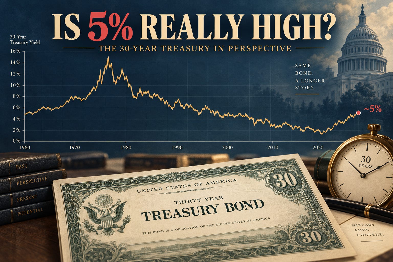
Barron’s recently called a 30-year Treasury auction attractive, saying it “could be a good buy,” while BMO Capital Markets strategist Vail Hartman said, “Valuations look cheap.”
That view is potentially justifiable, but far from a slam dunk: nominal 30-year yields above 5 percent have not been available for many years, while long-term TIPS offer a real yield close to 3 percent.
J.P. Morgan has similarly argued that the reset to higher bond yields has created more attractive opportunities in fixed income.
Those arguments invite investors to look at a chart like this:
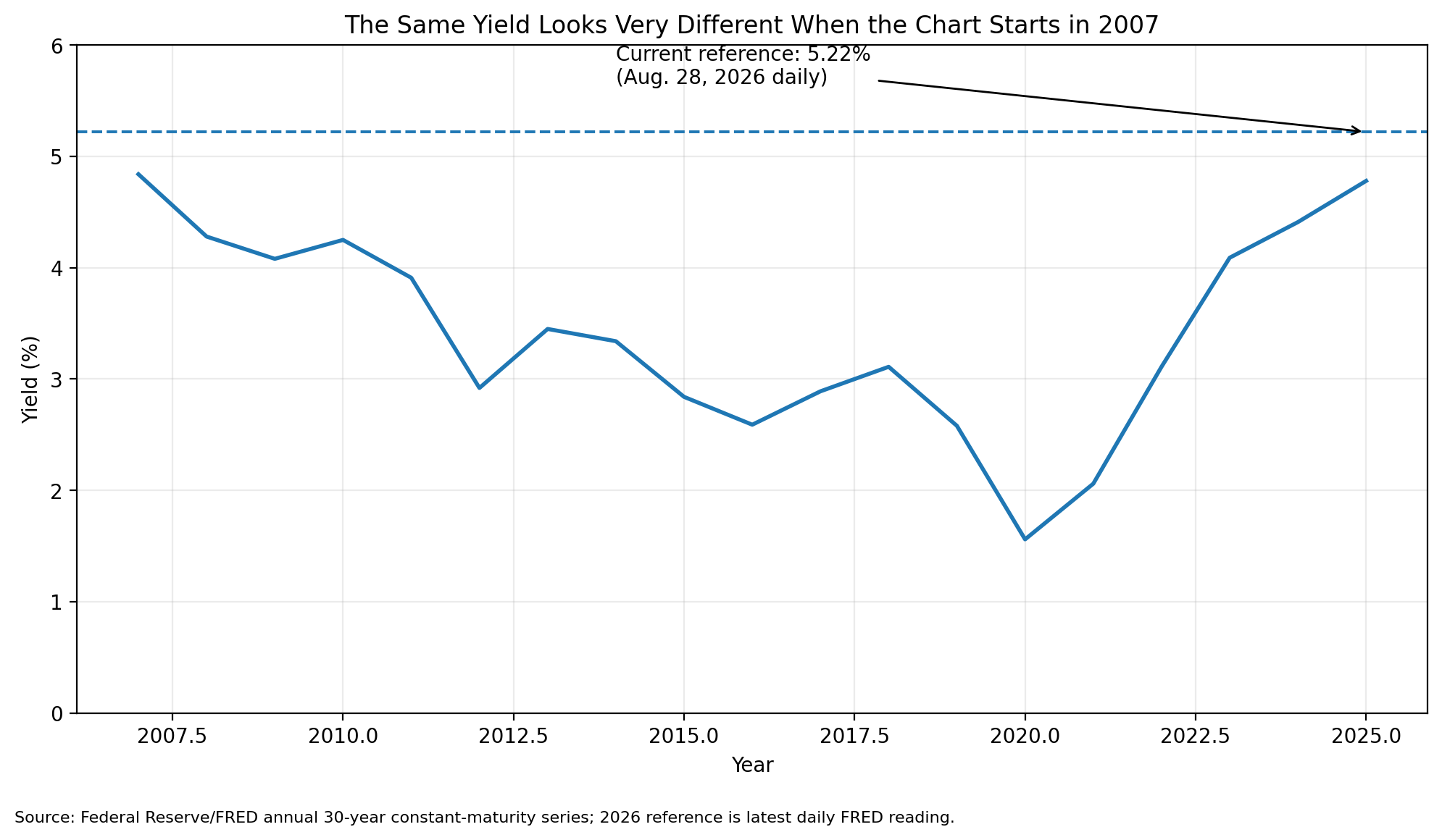
But before buying the 30-year because its yield is “the highest since 2007,” look at what happens when we change the starting date.
The 5¼ percent yield looks very different when viewed against the full modern history of the 30-year Treasury.
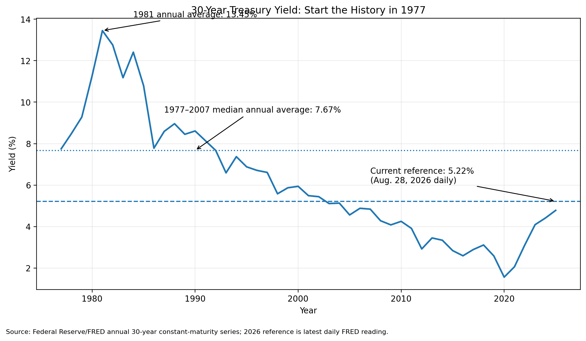
Starting the chart in 2007 makes today’s yield look extraordinary. Starting in 1977 shows that it followed an extraordinary period of low interest rates.
From 2007 through 2025, the median annual 30-year Treasury yield was about 3.3 percent.
From 1977 through 2007, the median annual 30-year Treasury yield was about 7.7 percent.
Some 30-year Treasuries may now be worth buying. But these charts suggest proceeding with considerable caution—and certainly not overweighting a 30-year position simply because yields are at their highest level since 2007.